

Process & Development Case Study
In the design of a logo, creating the tone, style, and feel of the logo are important, and in the development of the eventual business image. As part of the project process, the initial versions of the logo presented to a client should include multiple visual directions. With the designed logos having a style, feel and tone, with multiple different directions possible. Once a direction is chosen and the design finalized, it is carried into the design and development of the identity system, and then the brand image.
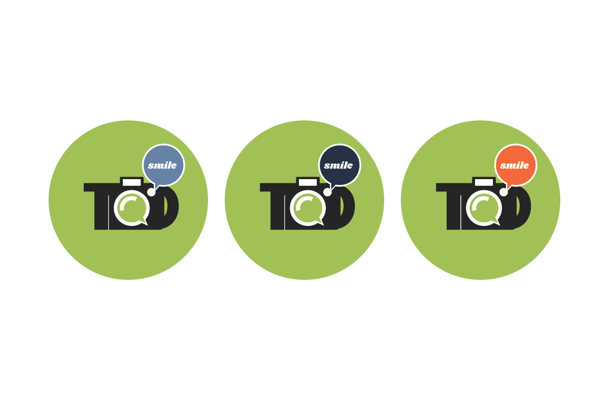
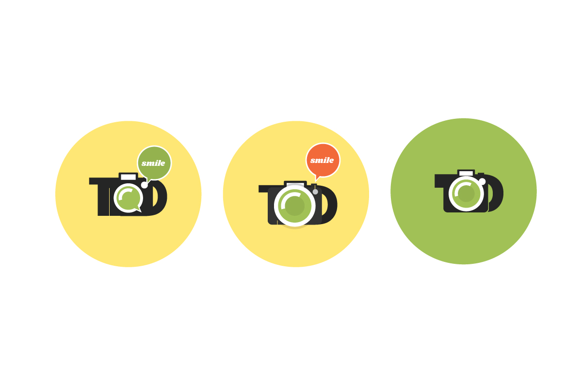
Within the design process, and as the project moves forward, additional versions of the logo's graphic should be explored. With explorations that include using different colors, holding shapes, and typefaces, with the logo then applied into lockups and layouts. To define usage of the logo and explore how these elements can change the feel of the logo. Not only the color, but hue of color, intensity of color, etc. each can change the feel of the logo. As can the amount of space around the graphic, the size of the graphic in the surrounding space, and the positioning of the logo’s graphic in the surrounding space.
Within the logo itself, elements can be pulled out to represent the client's services, products, offerings, and business value, and developed into an identity system. Because these elements are within the logo, they ensure the logo and graphics work as one, a core principle of good identity design.
Typography in logo design is essential, the typeface and graphic need to work as one. The letterforms must complement and work with the form of the graphic elements; The composition of the logo, the space around the elements, the tone and feel, all must complement and work with the form of the typeface. The typefaces chosen also must work in the layout of the business image. In addition to the typeface working with the graphic of the logo, the typeface must work in layouts for advertising and in all branded communications, and with secondary typefaces used in taglines and body copy.
The logo and identity system needs to be ingredients of the business image, with the tone and feel reflected in the writing, all working together as one. In addition, with the vast amounts of platforms where a business needs to be represented, a logo needs to be responsive, to size, space, and layout.
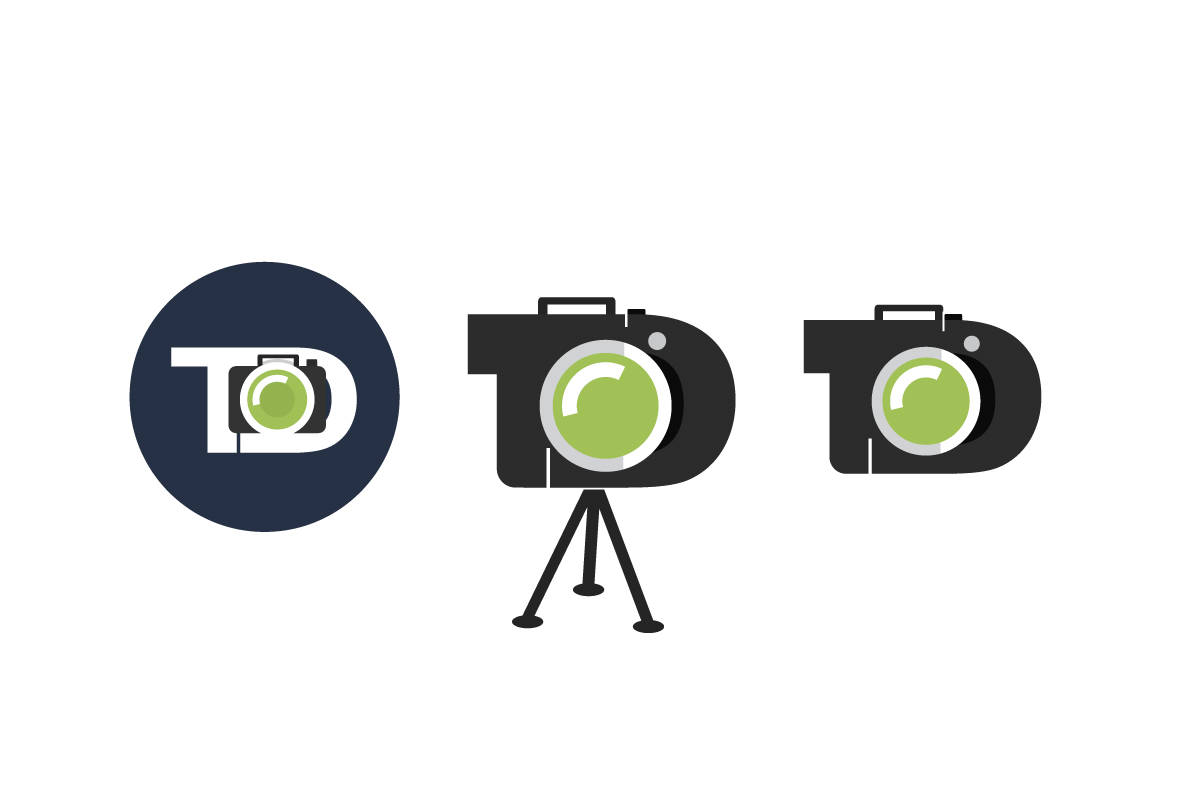
When designing a logo, making sure the logo is tailored to different sizes, spaces, and ratios of space is essential. That’s why there should be multiple versions of the same logo in various sizes and ratios, consistent in all instances. Because every logo cannot be responsive to all possible sizes and ratios, an identity system with secondary logo marks, icons, and graphic elements provides the needed solution. This is achieved through the design and development of the business image. Where usage and application of the identity system is fleshed out.
View the project at: https://adamgarlinger.com/recent-projects-and-work/photographer-identity-design.html
The Logo Design Process
In the design of a logo, creating the tone, style, and feel of the logo are important, and in the development of the eventual business image. As part of the project process, the initial versions of the logo presented to a client should include multiple visual directions. With the designed logos having a style, feel and tone, with multiple different directions possible. Once a direction is chosen and the design finalized, it is carried into the design and development of the identity system, and then the brand image.
Within the design process, and as the project moves forward, additional versions of the logo's graphic should be explored. With explorations that include using different colors, holding shapes, and typefaces, with the logo then applied into lockups and layouts. To define usage of the logo and explore how these elements can change the feel of the logo. Not only the color, but hue of color, intensity of color, etc. each can change the feel of the logo. As can the amount of space around the graphic, the size of the graphic in the surrounding space, and the positioning of the logo’s graphic in the surrounding space.
Within the logo itself, elements can be pulled out to represent the client's services, products, offerings, and business value, and developed into an identity system. Because these elements are within the logo, they ensure the logo and graphics work as one, a core principle of good identity design.
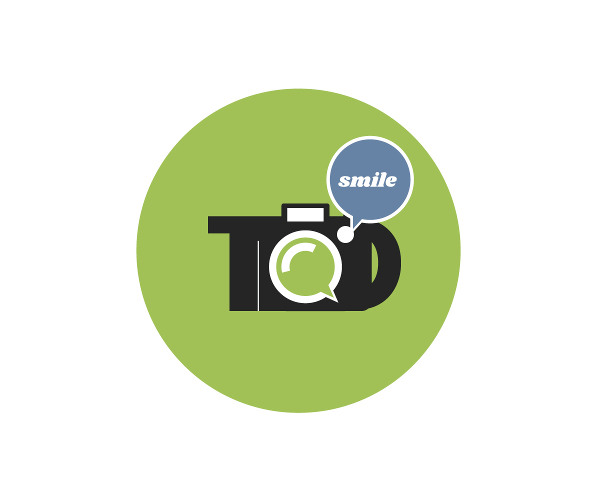
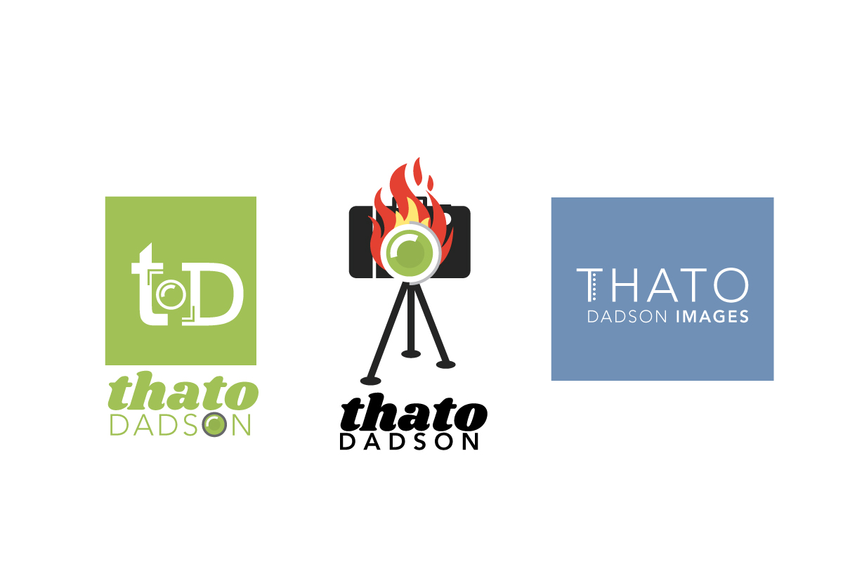
“Within the design of the Thato Dadson Images logo, the initial logo designs presented were strong graphic elements, playful with bold colors, and may have set a tone that would have boxed in the client. In the design of the business image, the colors of the logo may have pulled attention from the photographer’s work, which negates the project goals.”
Typography in logo design is essential, the typeface and graphic need to work as one. The letterforms must complement and work with the form of the graphic elements; The composition of the logo, the space around the elements, the tone and feel, all must complement and work with the form of the typeface. The typefaces chosen also must work in the layout of the business image. In addition to the typeface working with the graphic of the logo, the typeface must work in layouts for advertising and in all branded communications, and with secondary typefaces used in taglines and body copy.
The logo and identity system needs to be ingredients of the business image, with the tone and feel reflected in the writing, all working together as one. In addition, with the vast amounts of platforms where a business needs to be represented, a logo needs to be responsive, to size, space, and layout.
When designing a logo, making sure the logo is tailored to different sizes, spaces, and ratios of space is essential. That’s why there should be multiple versions of the same logo in various sizes and ratios, consistent in all instances. Because every logo cannot be responsive to all possible sizes and ratios, an identity system with secondary logo marks, icons, and graphic elements provides the needed solution. This is achieved through the design and development of the business image. Where usage and application of the identity system is fleshed out.
View the project at: https://adamgarlinger.com/recent-projects-and-work/photographer-identity-design.html


Case Study Notes
To ensure that the photographer’s work always takes center stage, a buffer color palette was developed. Working together with the colors of the logo, the business image, and the work shown, to ensure the photos shown are the main focus. Enabling the logo and layout supports the photos, not competing with them for attention. Because color is such an essential element of a visual brand, a buffer color palette works as a bridge between the images and identity system, especially in layouts for advertising where the colors of the brand may conflict with the photography or images.
To ensure that the photographer’s work always takes center stage, a buffer color palette was developed. Working together with the colors of the logo, the business image, and the work shown, to ensure the photos shown are the main focus. Enabling the logo and layout supports the photos, not competing with them for attention. Because color is such an essential element of a visual brand, a buffer color palette works as a bridge between the images and identity system, especially in layouts for advertising where the colors of the brand may conflict with the photography or images.





 View Case Study
