


Business Brand & Website Development
To build a stronger brand, the business value, differentiators, and competitive advantage are developed, and developed into a deep value formula. The formula becomes the foundation for the writing, messaging, and written content. This strengthens the perception of their services and offerings, and better positions the business in their industry and to their potential clients.
Starting with the development of the brand through to the development of the website, the project included the identity design, company image, messaging, writing, design system, website development, the components for the company's online presence, and brand guidelines. The project also included strategies for the maintenance of the site, and to continually strengthen the online visibility of the website.
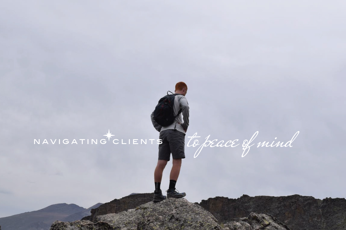
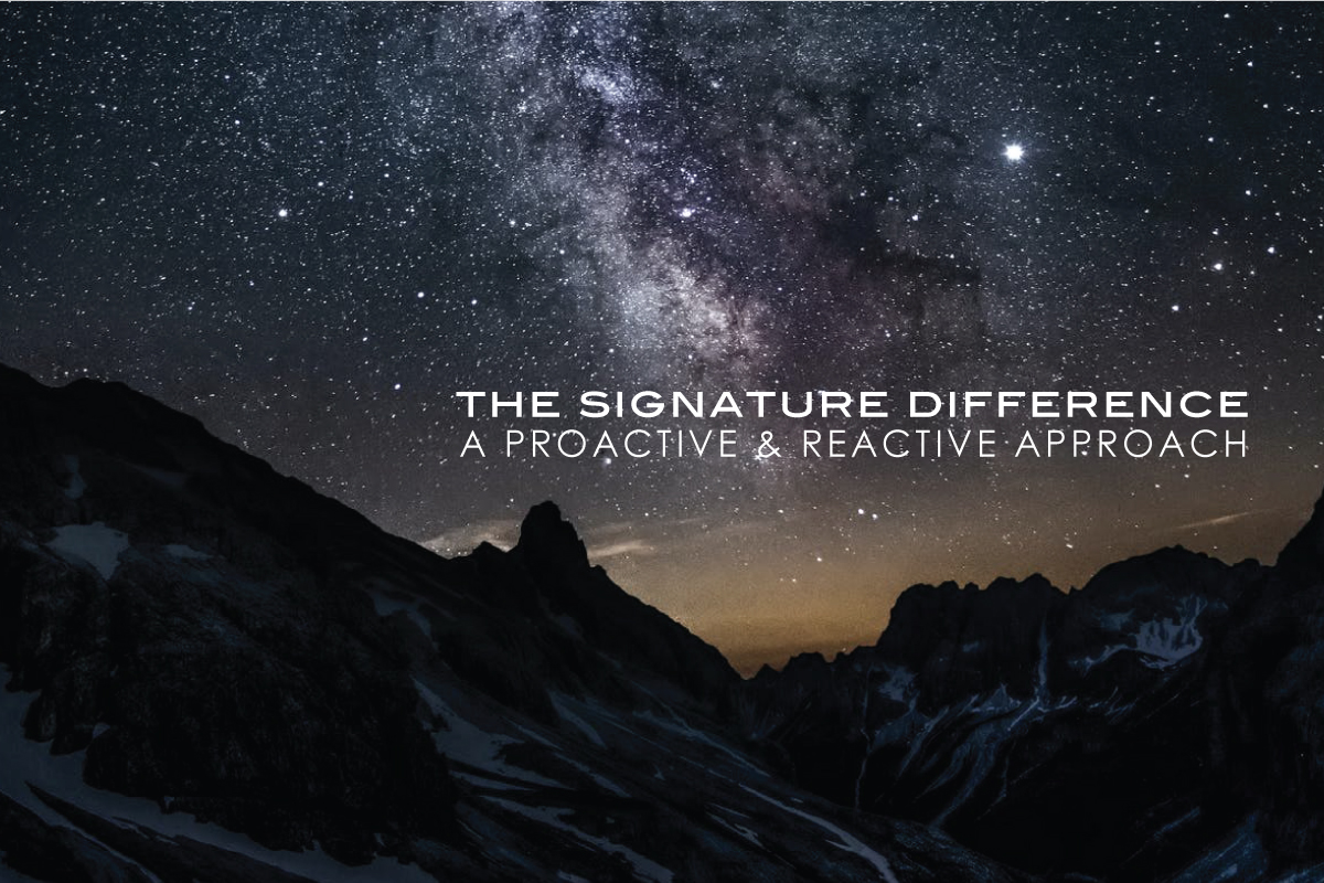
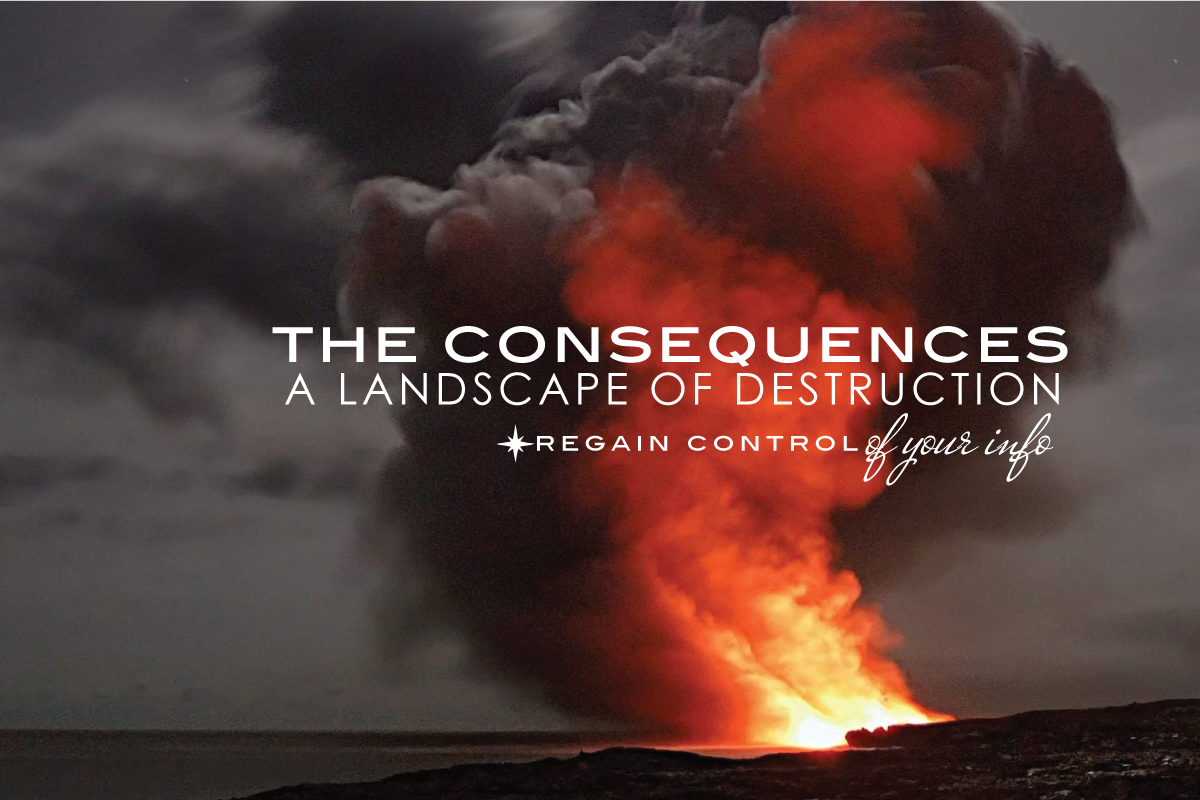
In the design of the visual brand, the process began with establishing a visual concept that worked with the established value formula and the writing. In the design process, the design of the logo, brand identity system, and the layout design was done together. This process ensures the visuals and written word work as one. In the choosing of the imagery, the photos reflected core elements of the brand, namely the “Journey” and “Navigation”, with those elements conveyed in the messaging and writing, aided by the typography and graphics.
The messaging, writing, and written content incorporated the company’s value, differentiators, and competitive advantage, with the brand architecture used to structure these ingredients within the written content. The writing reflected exploration, navigation, and vision, reflected in the photos and choice in typefaces. The design of the logo also reflected those elements, incorporating the elements of a compass and telescope to convey those. The elements in the logo were used to create the logotype and other components in the identity system, including the secondary logo, logotype, graphics, and icons.
Incorporating the identity system and visual concept, the company image was designed and built into layouts. It was created to be responsive to all sizes and ratios, while keeping the visual brand consistent. The company image was developed into layouts for communications, marketing, and the design of the website, with design guidelines ensuring the company image is consistent in all layouts and uses. The design guidelines for the visual brand had defined the usage of the identity system in all communication materials.
Designed from the established image and business brand, the website was planned and developed. The development included the design, writing, and build, with a focus on the structure of content in the site to strengthen the business value as the visitor navigates deeper into the site. Through layout and design, the site was responsive to all devices, using layout principles, design language, flexible graphic elements, and the usage of space to achieve that result. As with the visual brand and company image, the typography played an essential role in the look and feel of the site. Working with the photography, the typography helped to deliver an intended feel, as did the graphics.
In the planning of the site, choosing the development platform was essential. In addition to the goals of online visibility and presence, using the content of the site to deliver, then build-on and strengthen the business value were key reasons why a traditionally built (html) site was chosen over Wordpress. The site would utilize the website architecture; organization of pages, structure of content structure, and the navigation formula to achieve those goals. It would also use website maintenance, future additions to the site, and communication efforts like marketing, and outside content to consistently increase online visibility as time passed.
To ensure the website conveys the business brand and the solutions it provides, the value, differentiators, and competitive advantage were key ingredients in the content, as were the services and the offerings. To achieve this, the architecture of the site was essential, to ensure the website establishes, strengthens, and builds on these essential elements as the reader browses deeper into the site. In this approach, the writing, structure of content, pages of the site, links, and the website navigation work together. This not only better presents the business, it is essential to high online visibility. This approach enables the additions to the site, marketing efforts, landing pages, paid advertising, and online content to increase the visibility of the site.
The website was launched with strategies for deepening the business brand, developing content, adding to the site, increasing online visibility and search engine position, thus providing the client with a true turnkey solution for increasing the presence of their business.
Signature Advisors
To build a stronger brand, the business value, differentiators, and competitive advantage are developed, and developed into a deep value formula. The formula becomes the foundation for the writing, messaging, and written content. This strengthens the perception of their services and offerings, and better positions the business in their industry and to their potential clients.
Starting with the development of the brand through to the development of the website, the project included the identity design, company image, messaging, writing, design system, website development, the components for the company's online presence, and brand guidelines. The project also included strategies for the maintenance of the site, and to continually strengthen the online visibility of the website.
In the design of the visual brand, the process began with establishing a visual concept that worked with the established value formula and the writing. In the design process, the design of the logo, brand identity system, and the layout design was done together. This process ensures the visuals and written word work as one. In the choosing of the imagery, the photos reflected core elements of the brand, namely the “Journey” and “Navigation”, with those elements conveyed in the messaging and writing, aided by the typography and graphics.
The messaging, writing, and written content incorporated the company’s value, differentiators, and competitive advantage, with the brand architecture used to structure these ingredients within the written content. The writing reflected exploration, navigation, and vision, reflected in the photos and choice in typefaces. The design of the logo also reflected those elements, incorporating the elements of a compass and telescope to convey those. The elements in the logo were used to create the logotype and other components in the identity system, including the secondary logo, logotype, graphics, and icons.
Incorporating the identity system and visual concept, the company image was designed and built into layouts. It was created to be responsive to all sizes and ratios, while keeping the visual brand consistent. The company image was developed into layouts for communications, marketing, and the design of the website, with design guidelines ensuring the company image is consistent in all layouts and uses. The design guidelines for the visual brand had defined the usage of the identity system in all communication materials.
Designed from the established image and business brand, the website was planned and developed. The development included the design, writing, and build, with a focus on the structure of content in the site to strengthen the business value as the visitor navigates deeper into the site. Through layout and design, the site was responsive to all devices, using layout principles, design language, flexible graphic elements, and the usage of space to achieve that result. As with the visual brand and company image, the typography played an essential role in the look and feel of the site. Working with the photography, the typography helped to deliver an intended feel, as did the graphics.
In the planning of the site, choosing the development platform was essential. In addition to the goals of online visibility and presence, using the content of the site to deliver, then build-on and strengthen the business value were key reasons why a traditionally built (html) site was chosen over Wordpress. The site would utilize the website architecture; organization of pages, structure of content structure, and the navigation formula to achieve those goals. It would also use website maintenance, future additions to the site, and communication efforts like marketing, and outside content to consistently increase online visibility as time passed.
To ensure the website conveys the business brand and the solutions it provides, the value, differentiators, and competitive advantage were key ingredients in the content, as were the services and the offerings. To achieve this, the architecture of the site was essential, to ensure the website establishes, strengthens, and builds on these essential elements as the reader browses deeper into the site. In this approach, the writing, structure of content, pages of the site, links, and the website navigation work together. This not only better presents the business, it is essential to high online visibility. This approach enables the additions to the site, marketing efforts, landing pages, paid advertising, and online content to increase the visibility of the site.
The website was launched with strategies for deepening the business brand, developing content, adding to the site, increasing online visibility and search engine position, thus providing the client with a true turnkey solution for increasing the presence of their business.







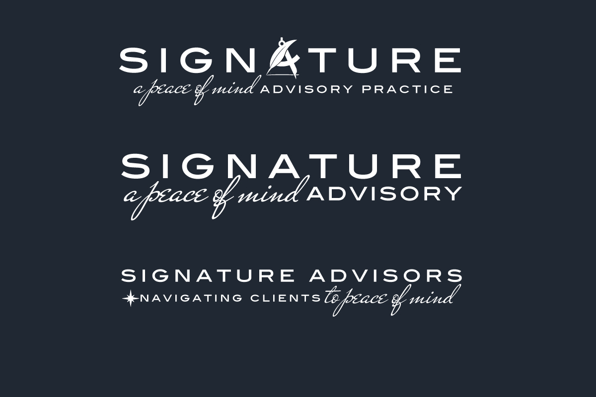

Project Notes Signature Advisors
To build a stronger business brand, the value, differentiators, and competitive advantage are applied into a deep value formula to build a deeper business brand. Then developed into the writing, messaging, and written content to create a compelling value proposition, and better position and present the business.
In the design of a visual brand and the business image, the process includes choosing the imagery that represents the concept, tone, and feel of the written word, the design of logo, the brand identity system, including the graphic elements, the typography, colors, and the exploration of layout design, This is a seamless process, to ensure the visuals and written word work as one.


Brand Development DaVinci
The project included the design of the medical practice brand, including the business image, identity, and copywriting. The development of the Practice brand included the business value, differentiators, competitive advantage, and value proposition, applied into the writing, messaging, and concept used to create the business image. View Project
The project included the design of the medical practice brand, including the business image, identity, and copywriting. The development of the Practice brand included the business value, differentiators, competitive advantage, and value proposition, applied into the writing, messaging, and concept used to create the business image.
 View Project


Brand Development Equanimous
The development of the Equanimous Practice brand included the design and development of the identity, the messaging, and the visual brand., Including the logo, tagline, messaging, statements, and the layouts for the business image for marketing and advertising. View Project
The development of the Equanimous Practice brand included the design and development of the identity, the messaging, and the visual brand., Including the logo, tagline, messaging, statements, and the layouts for the business image for marketing and advertising.
 View Project
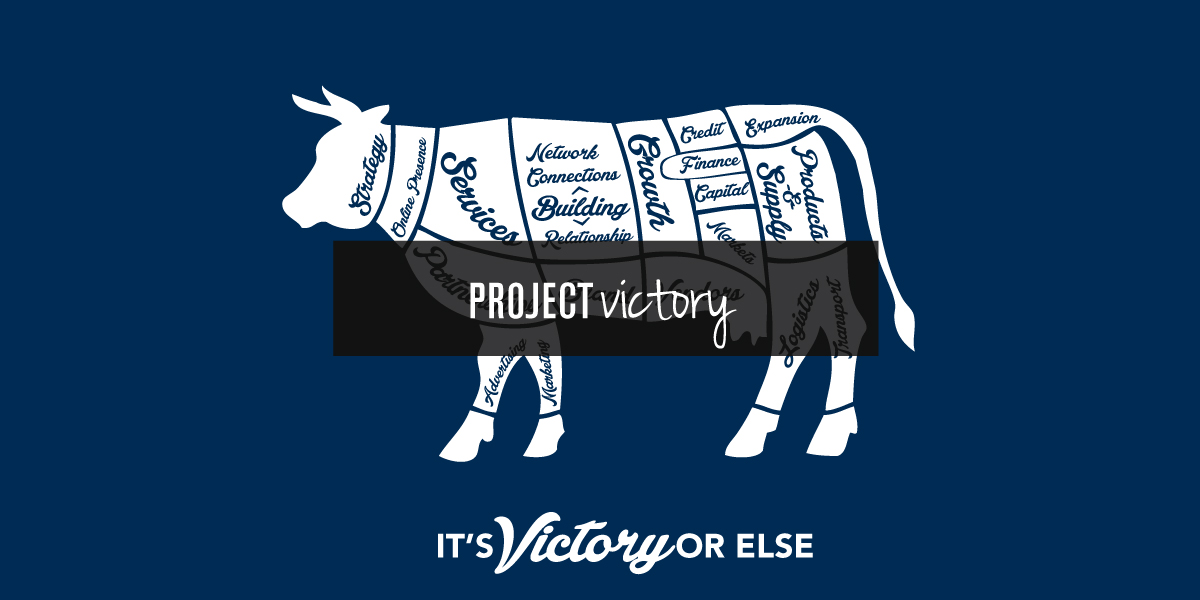

Brand Development Victory
Victory is an independent business development offering that connects businesses to clients, customers, and to other relevant businesses, building an independent business ecosystem. Victory was developed to work across the whole of the independent business community, with the architecture enabling it to be applied to multiple industries, professions, and trades. View Project
Victory is an independent business development offering that connects businesses to clients, customers, and to other relevant businesses, building an independent business ecosystem. Victory was developed to work across the whole of the independent business community, with the architecture enabling it to be applied to multiple industries, professions, and trades.
 View Project


Brand Evolution The Gardens
With the business renamed, the established brand needed to be carried forward, incorporating the equity it had built over the years. A new location was also being added which needed to be incorporated into the website, with an update to the website layout, content structure, and website architecture. View Project
With the business renamed, the established brand needed to be carried forward, incorporating the equity it had built over the years. A new location was also being added which needed to be incorporated into the website, with an update to the website layout, content structure, and website architecture.
 View Project
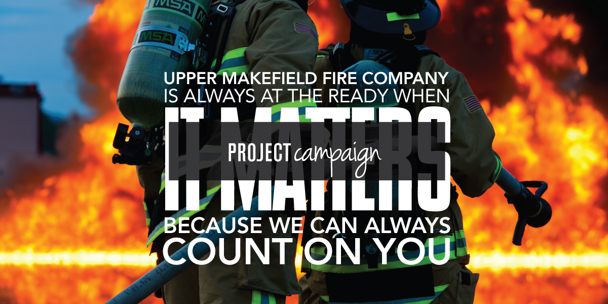

Campaign Design Upper Makefield
For the fourth straight year the Upper Makefield Fire Company hired Adam Garlinger to design their annual fundraising. A campaign to raise funds for the Fire Company’s operational needs, continued training, and education. As in previous years, the project development included the campaign concept, messaging, writing, and design, and layout of the mailer package. View Project
For the fourth straight year the Upper Makefield Fire Company hired Adam Garlinger to design their annual fundraising. A campaign to raise funds for the Fire Company’s operational needs, continued training, and education. As in previous years, the project development included the campaign concept, messaging, writing, and design, and layout of the mailer package.
 View Project


Development Creative Process
Starting the creative process, words and imagery, establishing the tone and feel of the messaging and imagery, the writing and the design are done together, as part of the initial creative process, with statements written out to create a feel for what the messaging will say and how it will be said. View Project
Starting the creative process, words and imagery, establishing the tone and feel of the messaging and imagery, the writing and the design are done together, as part of the initial creative process, with statements written out to create a feel for what the messaging will say and how it will be said.
 View Project


Located in New Jersey where Washington crossed the Delaware into New Jersey to win the war, Design Solutions Adam Garlinger is an advertising and design studio that helps clients differentiate their business from those they compete with...to stand out, be seen, and be remembered.
Delivering the first impression their business needs to accelerate the return on investment that is their business.
38 River Drive, Titusville New Jersey | adam@adamgarlinger.com
38 River Drive, Titusville New Jersey | adam@adamgarlinger.com
Design Solutions Adam Garlinger | 908.581.3393


